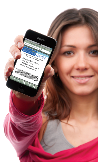
Convergence uses 'responsive' web technology to automatically adjust our online webstore pages based on the size of the display being used by the purchaser, allowing the same page content to be viewed on a smartphone, tablet, or desktop.
Convenience Without Apps
This provides your guests with added convenience, with no loss of content or product types when purchasing on a smartphone or tablet. There is no need to download apps and keep them updated - everything happens just by viewing the webpage in your browser.
Mobile-Optimized eTickets
For mobile orders, the eTickets provided at the end of the order are sized to display one at a time on the mobile phone display for ease of barcode scanning. Easy fingertip scrolling displays the next eTicket. Informational inserts such as flyers, maps, etc may still be 8.5 x 11 for easy printing or displaying with zoom.
Mobile has never been easier or better!
Product Types
- General Admission
- eConsignment
- Special Events
- Reserved Seating
- Gift Cards
- Retail
- Combos/Packages
- Timed Tickets
- Cabana Reservations
- Overnight Reservations
- School Class Reservations
- Group Tickets
- Memberships
- Season Passes
- Donations
- Adoptions
- Reserved Seating
Mobile Barcode Scanning
Convergence offers barcode scanners with modern imagers which can easily scan barcodes displayed on purchasers' smartphones - even outside in bright lighting. Our mobile barcodes are compatible with our print-at-home and kiosk barcodes, allowing the same scanners to scan all tickets. Our scanners are available in wireless PDA models or USB models for use with internet-connected PC's.
